Eclipse Soundscape
#Light/Dark Mode, #Accessible Design, #A11yDuration
12 weeks
Client
ARISA Lab X NASA
Team
Designer: 3
Mentor: Regine Gilbert, Professor @NYU
My role
User research, User experience design, Visual design, Usability testing
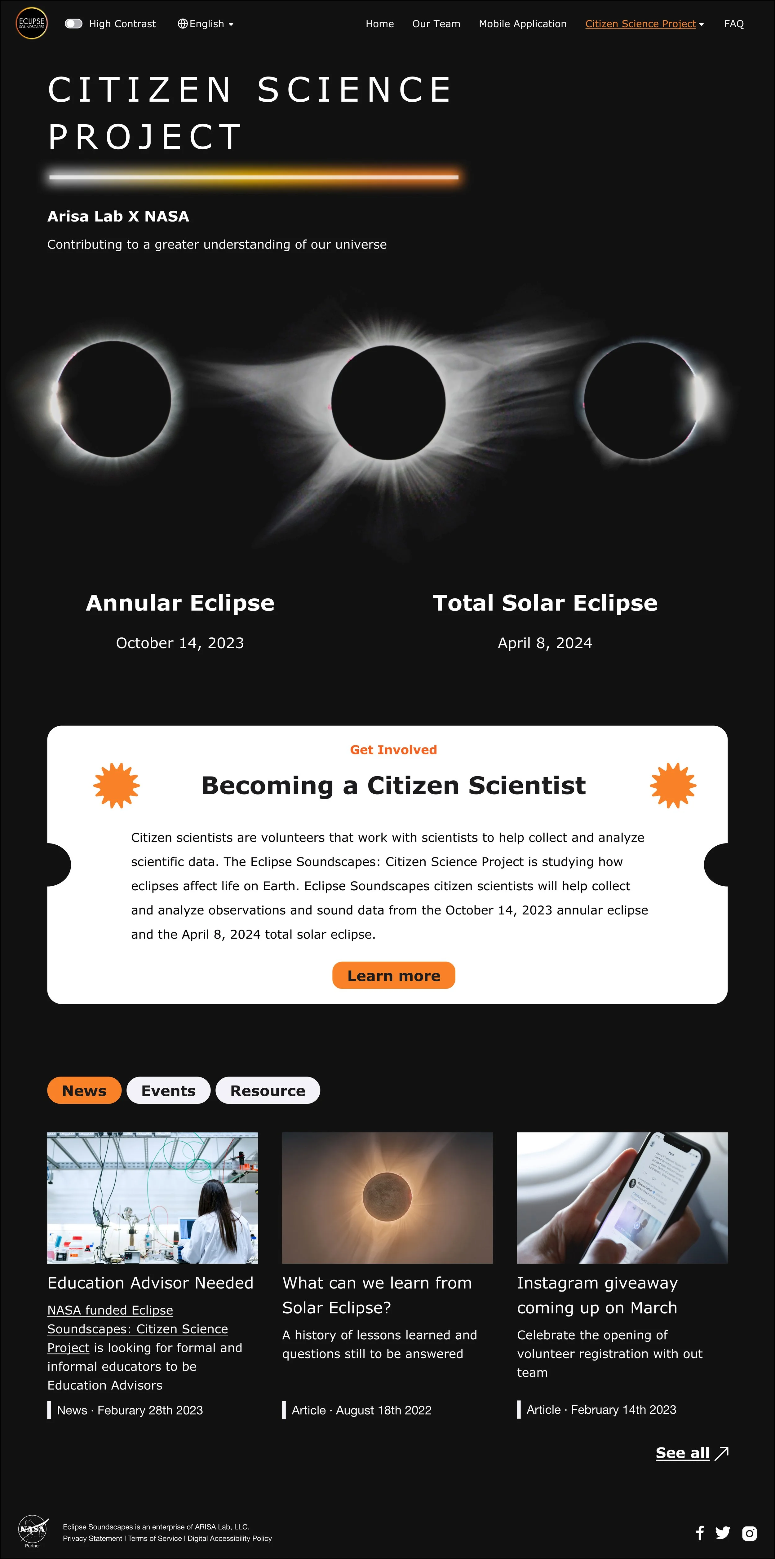
Eclipse Soundscapes Citizen Science Project (ES:CSP) is a NASA-partnered and funded project that aims to enable the Blind/Low Vision community to listen, interact, and analyze audio recordings from the 2023 eclipse on mobile app. The website on the other hand, aims to provide sufficient project information for people to get involved and provide research data from observing eclipse.
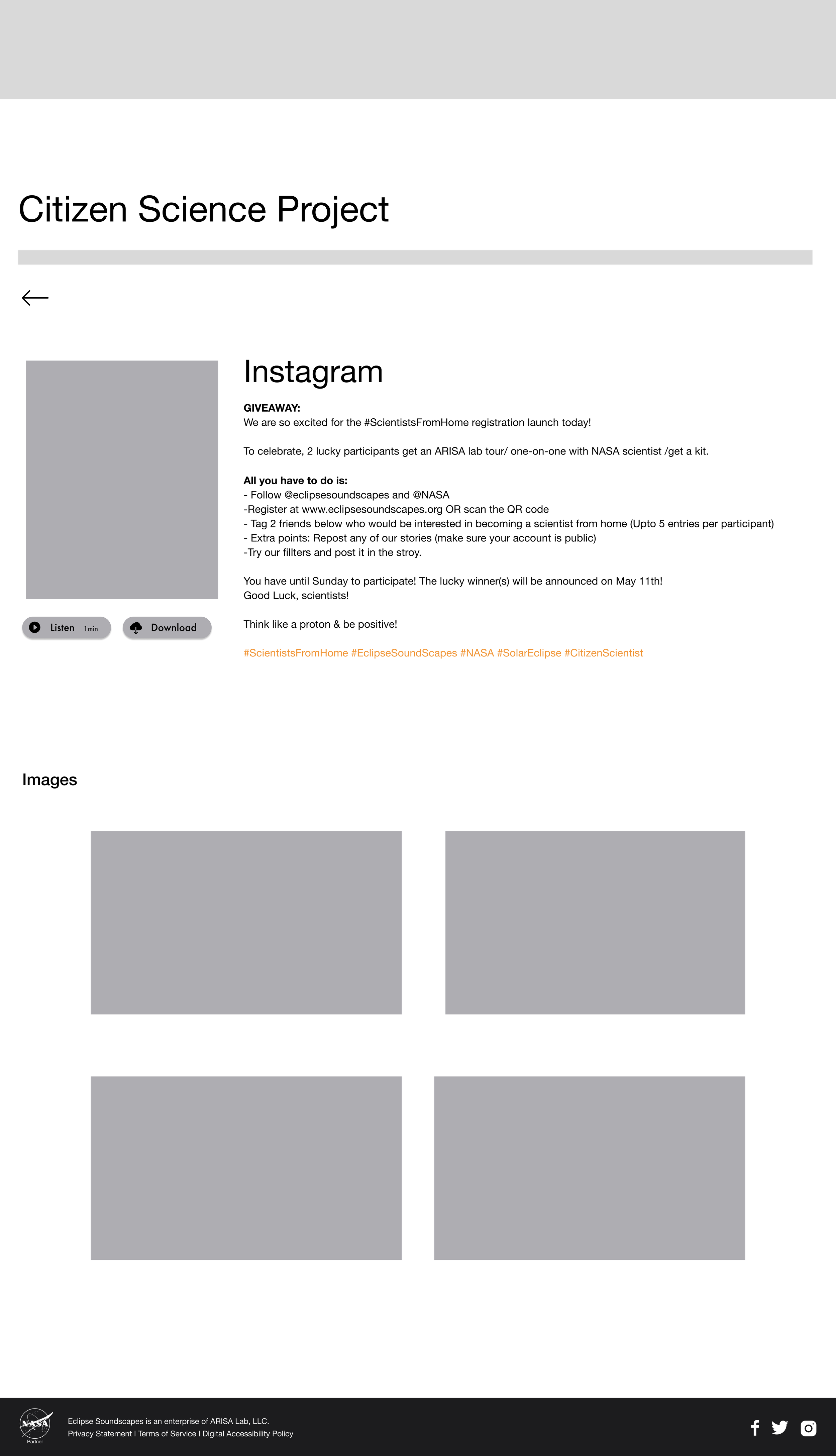
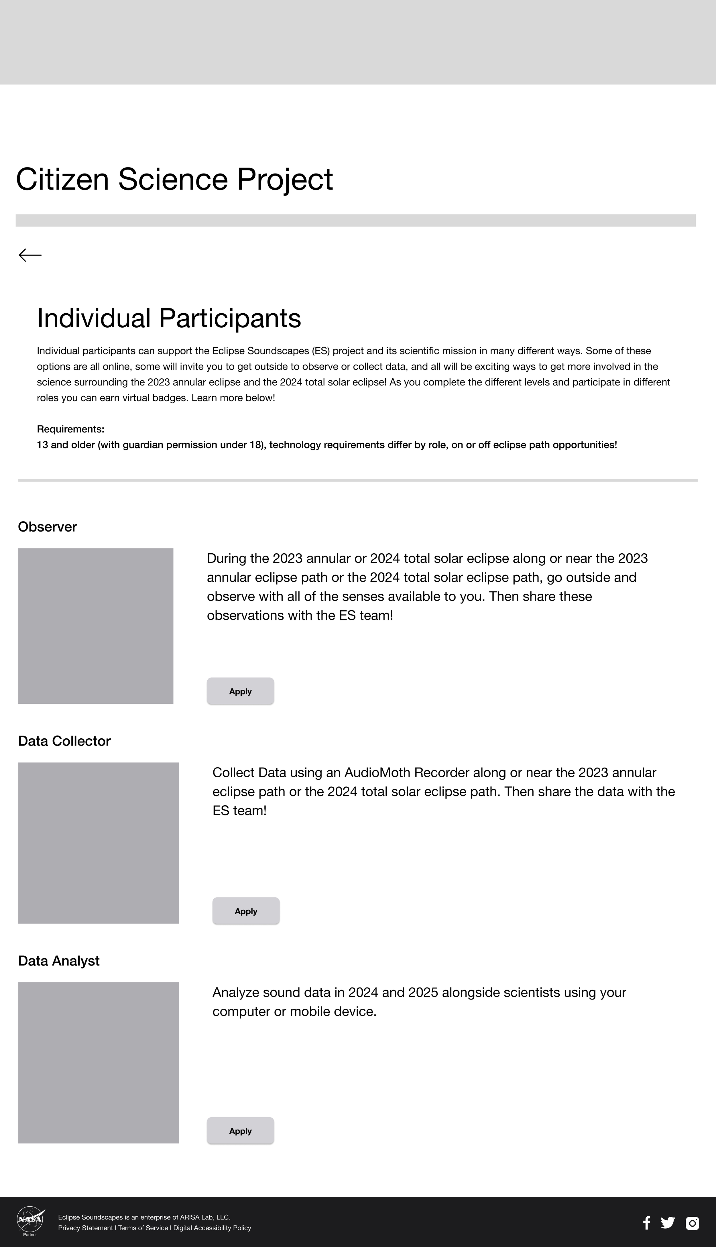
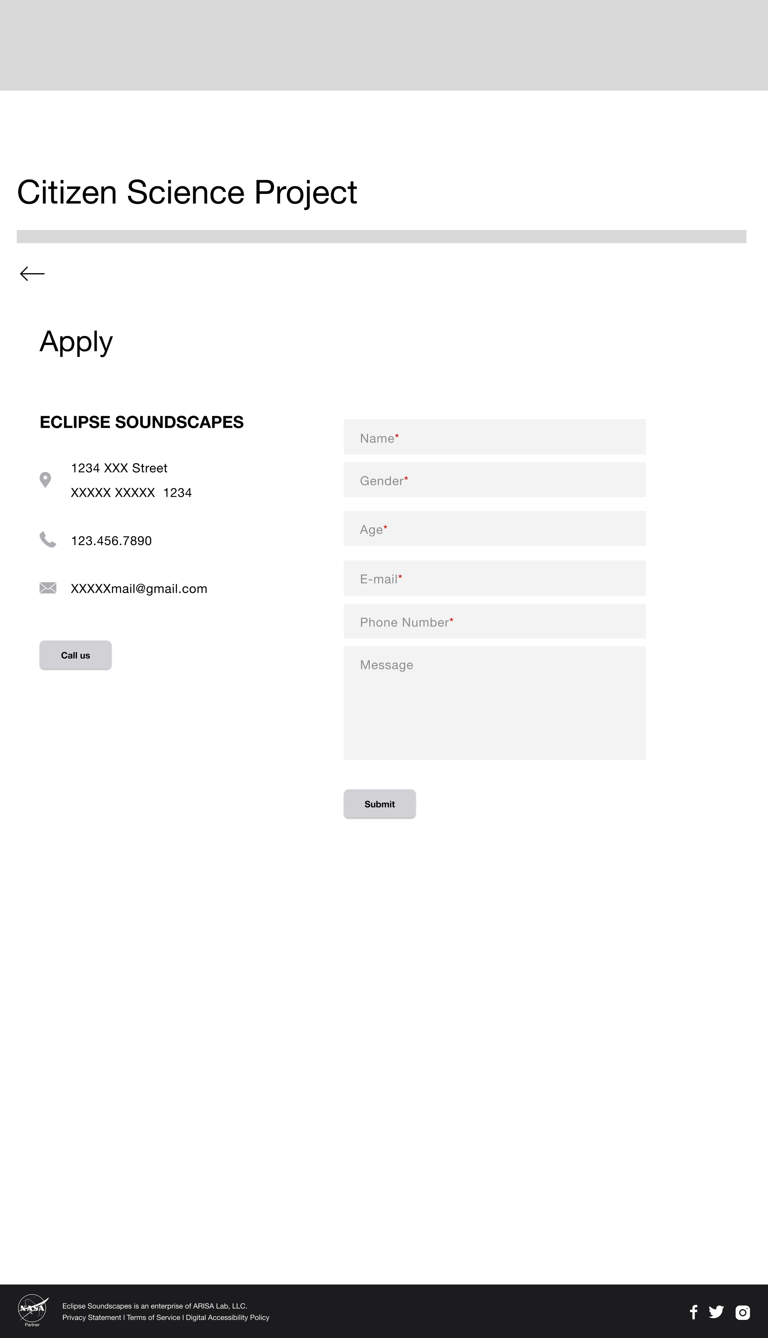
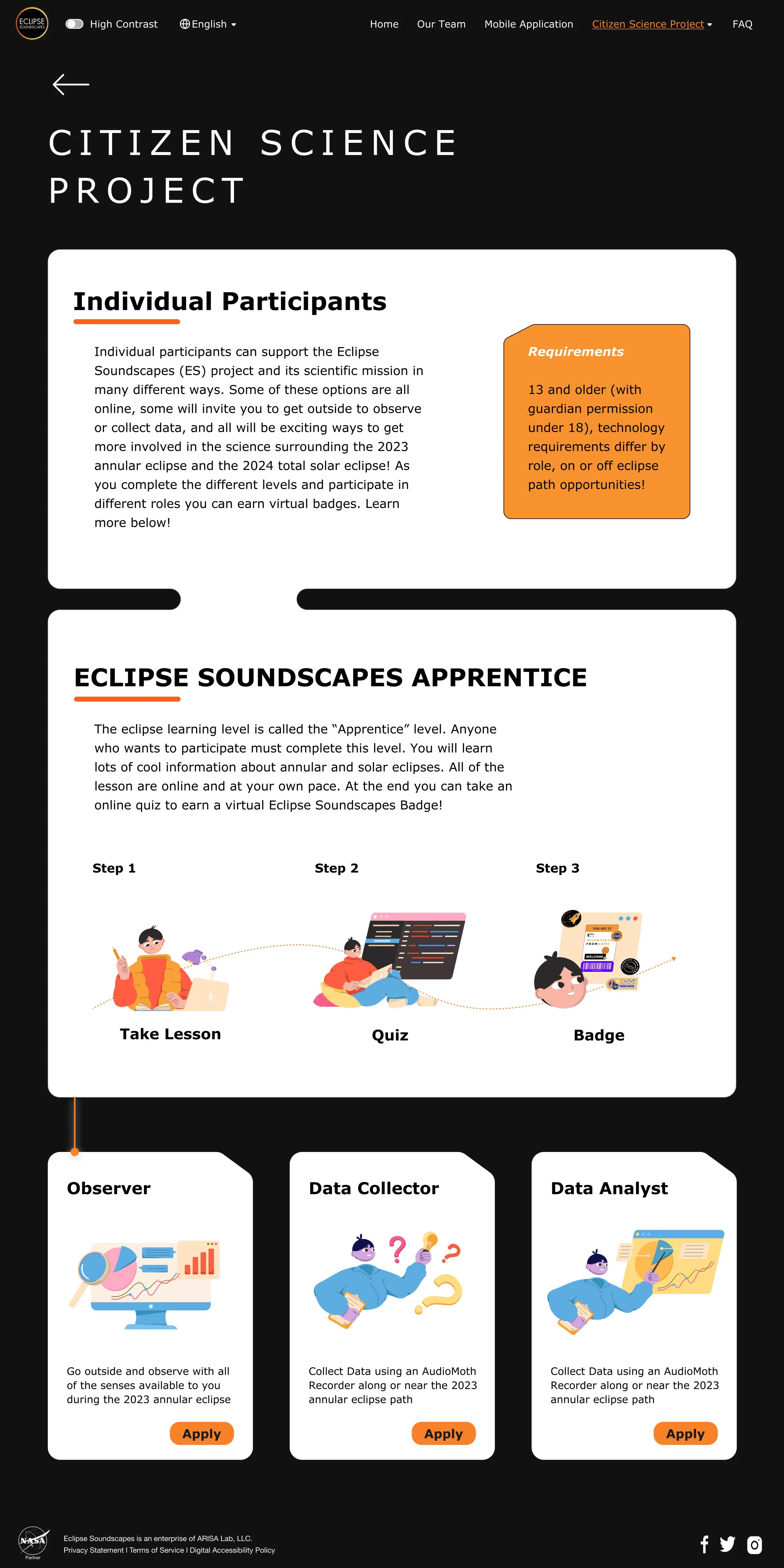
To better promote the project and make the application information accessible, we were tasked to redesign the website and add new project pages with accessibility consideration. Our team focused on the ES:CSP Homepage, and volunteer role page specifically.

Background
What exactly is Eclipse Soundscapes Project?
The Eclipse Soundscapes: Citizen Science Project (ES:CSP) is a NASA funded project that studies how eclipses affect life on Earth. Our client, ARISA Lab is hoping to recruit project volunteers (AKA Citizen Scientists) to help collect and analyze observations and sound data from the Eclipse events in 2023, 2024, and 2025.
ARISA Lab stands for Advanced Research in Inclusion & STEAM Accessibility Lab.
As an organization that emphasize heavily on inclusion and accessibility, ARISA Lab reached out to us, to redesign its website in order to make the project accessible to citizen scientists with or without disabilities.
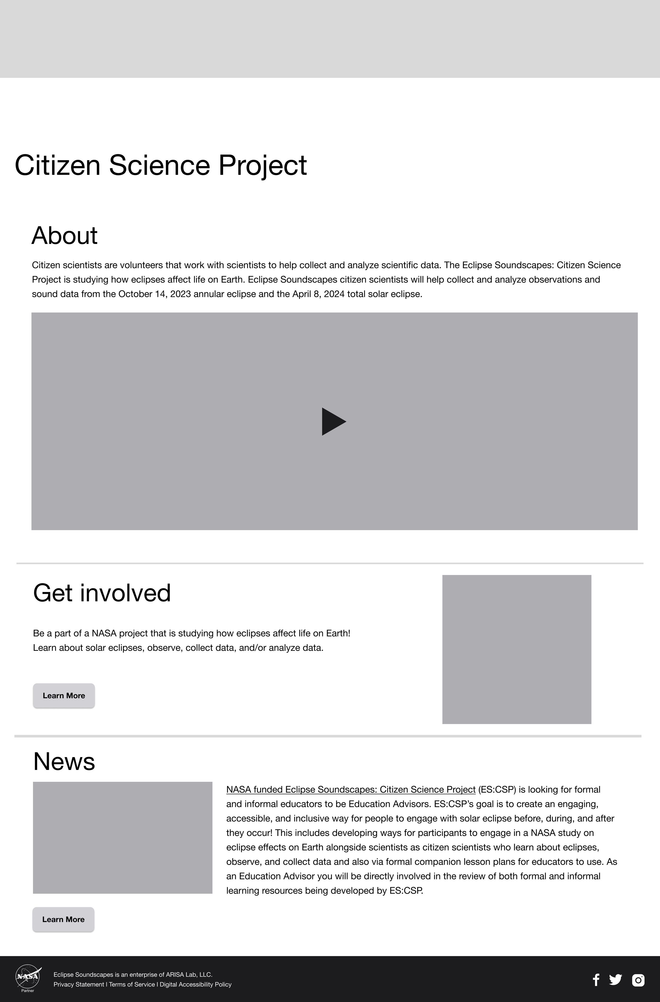
BEFORE
AFTER
Define the Problem
Insufficient project information provided on the website
As one of the main recruitment channels, Eclipse Soundscape’s website didn’t provide sufficient information for users to understand what the Citizen Science Project is and how to get involved. This lowers the discoverability of the project and the possibility of recruiting the volunteers they need.
“People who are interested in citizen science, especially those with visual impairments, don’t have access to the necessary information and resources to learn about Eclipse Soundscapes.”
Initial ask from ARISA Lab
“We want to make our website accessible and user friendly for sighted and BLV users to get involved in Science”
Our Target User
Challenge
How can we enhance web accessibility and visual appeal for the younger audience group while aligning with the brand’s pre-existing visual system and business goals?
Other than sighted and BLV(blind and low-vision) users, middle school students interested in Science, age range 10-14 yrs old, is considered as the main target age group for this project.
Goal
Attracting volunteers by providing accessible navigation experience
Identify accessibility barriers and usability issues
1. Evaluate current website’s accessibility and user flow
2. Draft out survey questions to further identify user pain points
2. Provide redesign recommendations following WCAG guideline
Ideate and prototype new design opportunities
1. Prototype new web pages to satisfy the need in promoting Eclipse Soundscape Project
2. Iterate based on user testing results
Accessibility Evaluation
Getting a sense of the user experience with WCAG guidelines
Before jumping straight into new web pages, I first evaluate the accessibility of Eclipse Soudscapes’ current website with WCAG in mind, identifying areas that needs improvement in color, layout and navigation.
Reading comprehension & color contrast
Pain Points
1. Poor readability: full width paragraph is hindering the readability of the content
2. Dark mode being the default and only option: Dark mode can diminish eye strain in general, but for people with dyslexia and astigmatism, reading in a total contrast could be a problem
Opportunity
1. Use optimal line length, simplified language and redesigned layout to improve the readability of written content
2. Provide more interface modes—adding both light & dark mode to increase accessibility and serve different user needs
Navigation experience
Pain Points
1. Lacking perceived affordance of clickability: users wouldn’t know the text is actually a hyperlink before hovering over
2. Lacking breadcrumb: Users can’t navigation between pages easily as “back button” is not provided for subpages
Opportunity
1. Differentiate links text with color and underline
2. Use breadcrumb navigation to help users understand the relation between their location on a page and higher level pages
Component consistency & alt text
Pain Points
1. Visual inconsistency: Components are not aligned on the page
2. Missing alt text: Some images/videos are missing alt text and video transcript
3. Use of Abbreviation: screenreader users might have a hard time understanding the context
Opportunity
1. Provide text alternatives (‘alt text’) for non-text content or mark them as decorative
2. Provide transcripts for audio and video
3. Avoid using abbreviations, or use<abbr> tags to supply a key with their meaning
Design Guideline
Readability
Increase text readability with simplified language and redesigned layout
Alternatives
Provide alternative ways (alt text, video transcript, dark & light mode, etc) for users to interact with the website
Consistency
Make sure all design elements are consistent, aligned and shows a sense of visual hierarchy
Engagement
Use audio, video and visually appealing design to increase engagement and interaction rate for younger audience group
User Flow & Initial Sketch
Prototype

